 Image 1 of 1
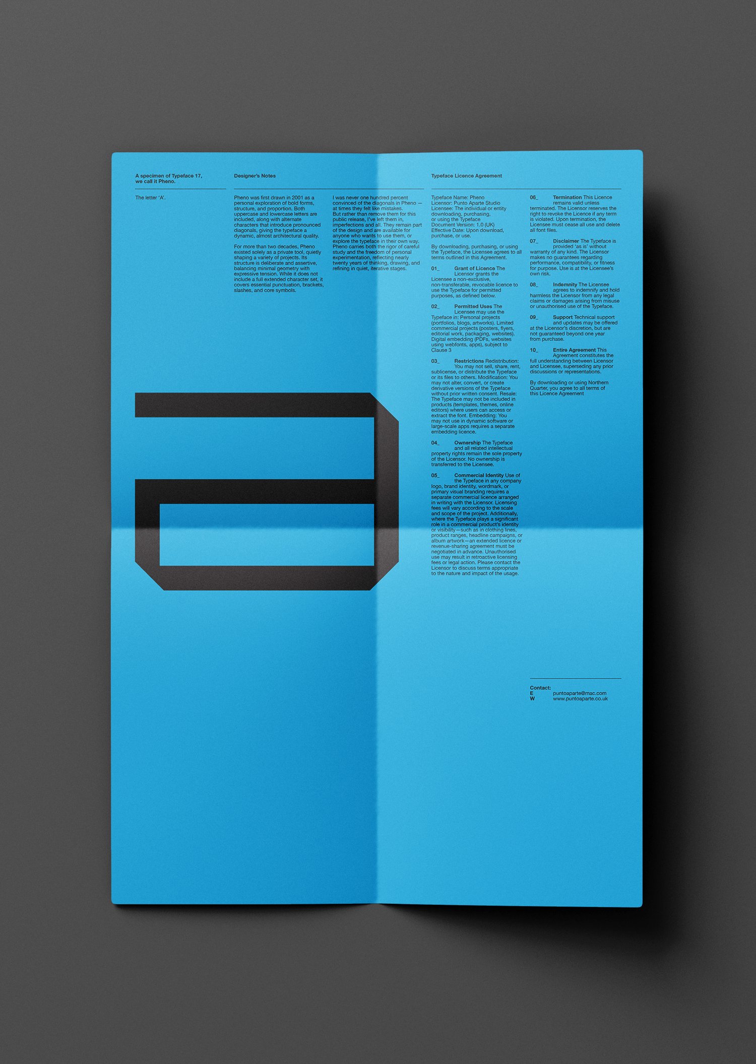
Pheno was first drawn in 2001 as an exploration of bold structure and directional form. Built with both uppercase and lowercase characters, it balances controlled geometry with a distinctly architectural edge. A set of alternate characters introduces some pronounced diagonals, allowing the typeface to shift in tone.
For nearly two decades, Pheno existed as a private working tool, quietly shaping a range of projects. Over time, proportions were refined, spacing tightened, and forms sharpened. It was never originally intended for release, but through continued use it evolved into a cohesive and dependable system.
Pheno is deliberately focused rather than expansive. While it does not include a full extended character set, it provides essential punctuation, brackets, slashes, and core symbols — making it well suited to editorial layouts, identity systems, and display use where clarity and presence matter.
The diagonals have always divided opinion — even my own. I was never entirely convinced by them, yet removing them felt dishonest. Instead, they remain: unapologetic, structural, and available for use where tension and direction are required. They are part of the typeface’s history, and part of its character.
This release marks the first time Pheno has been available as an installable typeface. After nearly twenty years of personal use and refinement, it is now ready to move beyond my own projects and into yours.
Please note: This is a digital product. No physical item will be shipped.